

#FCFCFB
Paper
RGB 252, 252, 251
The default page surface. Give ideas and imagery room to breathe.
A shared language for the things we make. Use this guide to bring the same clarity, craft, and human perspective to every Blue Drop experience.
Download logo kitBlue Drop is our shared identity. The aqua drop and Deep green wordmark stay consistent; the lighter lowercase labs descriptor identifies our digital consulting firm. Future businesses can use the same mark with a different descriptor, on the same baseline in Geist Regular. Use the supplied artwork and preserve its proportions.

Our first choice on Paper, Ice, and other clear, light surfaces. The wordmark uses Deep green (#002024). Keep the drop, wordmark, and labs descriptor together.
In the header, the drop gives a brief ripple on arrival and on hover or keyboard focus. The wordmark stays still. Reduced motion keeps the mark static.
Download primary SVG
The supplied reversed artwork brings the wordmark into focus on Deep green. Preserve the original file colors.
Download reversed SVG
Use the drop on its own for avatars, small application icons, or places where the full name already appears nearby. This is the original drop extracted from the logo.
Download the drop SVGOne family. Distinct businesses. Blue Drop is the parent identity. The lowercase labs descriptor identifies our digital consulting firm. Future businesses can use the same mark with their own descriptor, on the same baseline in Geist Regular.
Give it space. Keep at least half the drop’s height clear on every side of the artwork.
Keep it legible. Start at 140 px wide for the full logo or 24 px for the drop, and check the actual output.
Keep it original. Preserve the shape, spacing, and colors. Never stretch, retype, outline, or add effects to the mark.
Blue is our signature. Each practice has a consistent home within the palette: Sky blue for Design, Lavender with Violet accents for Development, and Seafoam for AI. These colors connect the homepage cards to each practice’s hero, graphics, section backgrounds, and closing invitation. White and softly tinted surfaces give longer passages room to breathe.
RGB 252, 252, 251
The default page surface. Give ideas and imagery room to breathe.
RGB 240, 246, 245
A quiet change of surface for supporting sections and working examples.
RGB 0, 32, 36
Our reading color on light surfaces, and the foundation for dark sections.
RGB 0, 122, 156
Links, emphasis, and the blueprint surface. Our strongest blue.
RGB 45, 184, 207
The drop’s signature color. Use it for graphic accents and moments of energy.
RGB 114, 216, 232
A brighter supporting surface for diagrams and illustrations.
RGB 167, 236, 255
An open, optimistic field for design work and useful highlights.
RGB 184, 255, 227
A supporting accent for interaction feedback and selected details.
RGB 230, 226, 255
Development’s signature surface. A light, distinct home for engineering content.
RGB 93, 78, 146
Development’s graphic and interaction accent. Pair with Lavender or Paper.
RGB 72, 98, 103
Captions and supporting copy on Paper or Ice. Keep it readable.
#BDDADBSupporting copy on Deep green. Its softer tone stays comfortably readable.
#BDCECEQuiet dividers between related content. Never use it for body text.
Sky blue is the signature surface. Blue graphics and Deep green type give the practice an open, expressive feel.
Explore DesignLavender is the signature surface. Violet linework and Deep green type create a light, precise expression for engineering.
Explore DevelopmentSeafoam leads the experience. Blue orbital graphics and Deep green type keep the practice bright and approachable.
Explore AIThese combinations are rendered in their actual colors. Contrast is calculated from the shared tokens; every pairing below meets the 4.5:1 minimum for ordinary text.
Everyday reading
16.60:1 contrastLinks and emphasis
4.80:1 contrastIdeas with room to grow
13.06:1 contrastA useful highlight
14.98:1 contrastA confident dark surface
16.60:1 contrastSupporting copy on dark surfaces
11.54:1 contrastBrand blue surfaces
4.80:1 contrastDevelopment reading
13.54:1 contrastDevelopment accents
5.62:1 contrastUse Deep green for text on the pale colors. Aqua and Light blue work as surfaces or graphics; keep small text on Paper in Deep green or Brand blue. Pair controls with visible labels and focus states.
Geist is our everyday voice, from a bold opening thought to the detail that makes a decision easier. One family keeps the experience connected. Scale, spacing, and weight create the hierarchy.
ABCDEFGHIJKLMNOPQRSTUVWXYZ
abcdefghijklmnopqrstuvwxyz
0123456789 & @ ! ?
A live specimen. Edit the text to see how your words feel in the brand.
Use medium weight for headings and regular for paragraphs. Keep tight display spacing, comfortable body leading, and sentence case. Preserve deliberate line breaks when they help the thought land.
Get the Geist typefacesFor code and technical notation. Use Geist with tabular numbers for business results and comparison tables.
const outcome = human + craft;| Role | Weight | Size | Line height |
|---|---|---|---|
| Display | Medium · 500 | 48–96 px | 1.05–1.1 |
| Section heading | Medium · 500 | 32–64 px | 1.1–1.2 |
| Subheading | Medium · 500 | 20–28 px | 1.25–1.4 |
| Body | Regular · 400 | 16–20 px | 1.5–1.7 |
| Caption / label | Regular or medium | 12–15 px | 1.5–1.6 |
Scale with the viewport. Keep body text at least 16 px, avoid display tracking tighter than −0.04em, and let a readable line length guide the layout. The wordmark is artwork; Geist does not replace it.
Confident, direct, and grounded in what we can help someone achieve. Our writing should make expertise easier to understand and the next step easier to take.
Name what changes for the customer. Connect the work to a better experience, a lower operating cost, or a new capability.
Turn a slow, manual process into a workflow your team can trust.
Human judgment directs the work. Artificial intelligence helps us explore, build, and evaluate faster. Make responsibility clear.
Our people lead the strategy. Intelligent tools accelerate the execution.
Show the work behind the claim. Link client outcomes to a case study. Label estimates and explain their assumptions.
See how we helped POWDR reduce software costs by 70%.
Write like a capable person talking to another person. Use familiar words and action labels that explain where a link goes.
Tell us what you want to improve.
Write “Blue Drop Labs” for the company’s full name and “Blue Drop” in conversation. Spell out “artificial intelligence” on first mention in explanatory copy; “AI” works in navigation and subsequent references. Keep the logo’s lowercase lettering in the artwork.
Consistency comes from a few clear decisions, applied with care. The content sets the pace; the brand helps people find their way.
Lead with one useful idea. Group its supporting detail, then leave enough space for the next thought. Use the shared page gutter and a clear reading order.
Use original graphics, thoughtful diagrams, and authentic product imagery. Do not use stock photography. Keep the distinction between client work and an illustrative example clear.
Use a reveal to establish hierarchy or a transition to connect two states. The homepage blueprint is our focal opening sequence; reading pages stay ready to use.
Keep labels visible, focus obvious, and controls usable by keyboard. Respect reduced motion and provide complete content when JavaScript is unavailable.
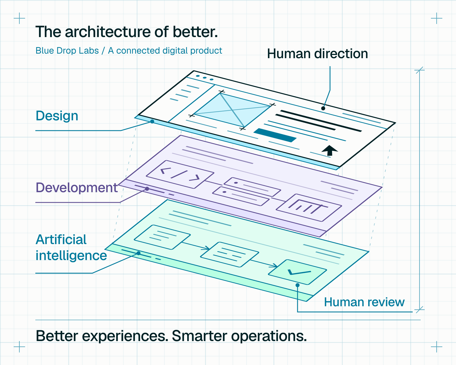
Our homepage draws this blueprint, then moves it into the hero at a constant aspect ratio. The same drawing stays in place after landing.
Keep everyday feedback brief, give focal sequences time to resolve, and make every nonessential sequence skippable. Reduced motion shows the completed work.
The color values on this page come from the same source as the website. Take the assets and tokens with you, then return here when a design decision needs a reference.
| Color | Hex | RGB | CSS token |
|---|---|---|---|
| Paper | #FCFCFB | 252, 252, 251 | --studio-paper |
| Ice | #F0F6F5 | 240, 246, 245 | --studio-ice |
| Deep green | #002024 | 0, 32, 36 | --studio-ink |
| Brand blue | #007A9C | 0, 122, 156 | --studio-blue |
| Aqua | #2DB8CF | 45, 184, 207 | --studio-aqua |
| Light blue | #72D8E8 | 114, 216, 232 | --studio-light-blue |
| Sky blue | #A7ECFF | 167, 236, 255 | --studio-sky |
| Seafoam | #B8FFE3 | 184, 255, 227 | --studio-accent |
| Lavender | #E6E2FF | 230, 226, 255 | --studio-lavender |
| Violet | #5D4E92 | 93, 78, 146 | --studio-violet |
| Muted text | #486267 | 72, 98, 103 | --studio-muted |
| Mist text | #BDDADB | 189, 218, 219 | --studio-mist |
| Rule | #BDCECE | 189, 206, 206 | --studio-rule |
Building a new Blue Drop page? Start with these assets, pairings, and writing principles. Carry forward the existing navigation, use the shared tokens, and review the result on a small screen as well as a large one.